20Sides
2018 | Brand Identity | Web Design
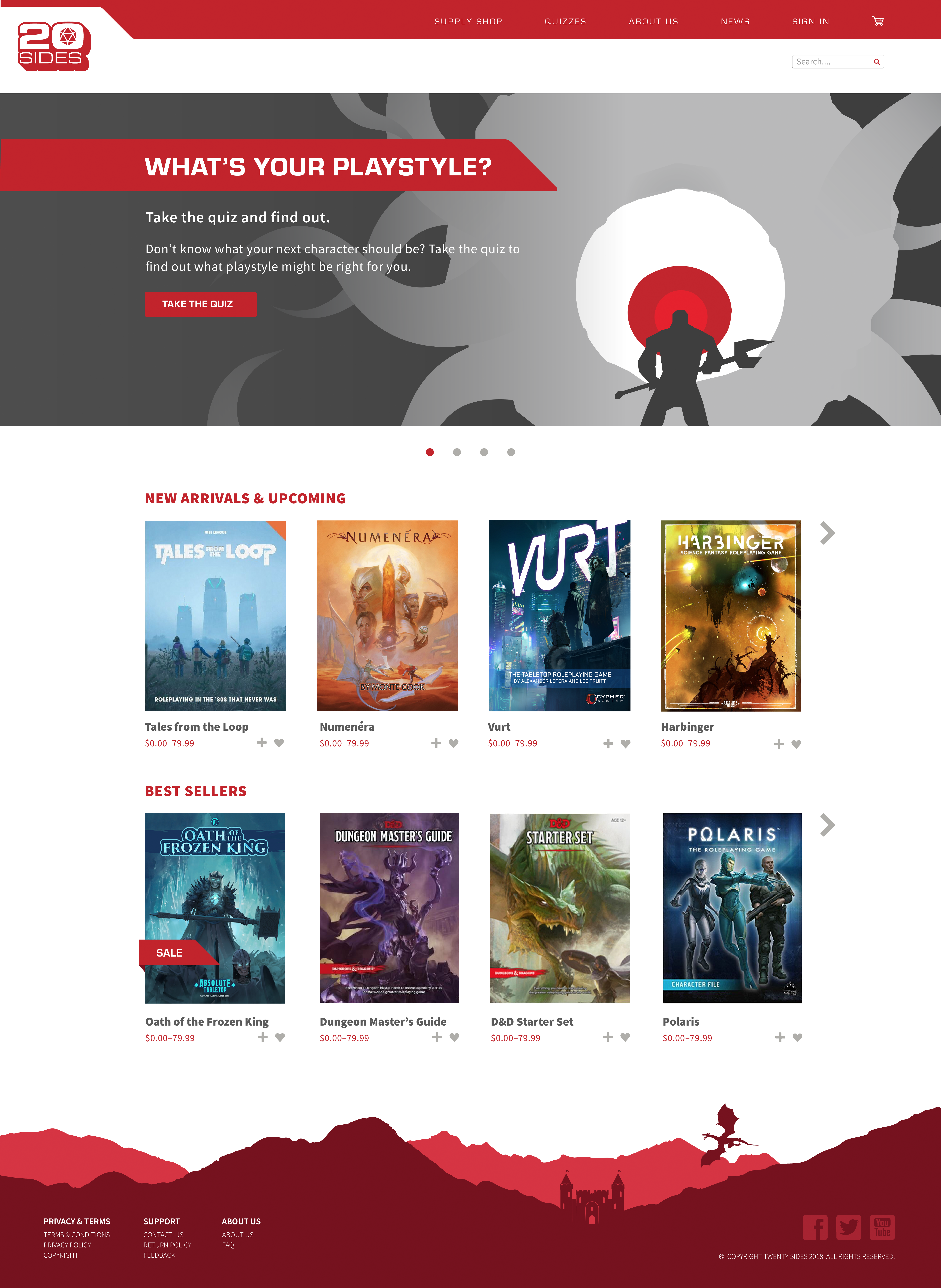
20Sides is a hypothetical tabletop roleplaying game product provider, aiming to create a easy gateway to both materials and mechanics of various games/systems.
We wanted to keep the logo clean and simple to set it apart from competitors who tend to get stuck in the overbearing medieval fantasy aesthetic. To further this differentiation, we also went with Eurostile for one of the primary typefaces both in our logo and throughout the site. Eurostile has a nice tech vibe that also resonates with our focus on online resources. The 3D drop shadow was added to call back to 70s type as the popularity of tabletop RPGs were first gaining traction. The angle used also became a reoccurring motif throughout the brand.
Collaborators:
Kristen LaBarbera