Dinner Lab
2017 | Brand Identity | Minor Campaign
Dinner Lab was a experimental dining experience provider that focused heavy on trying new things. Between the concept and the name, it made sense to mix the visual language of fine dining with a tech-y and science based visual language.
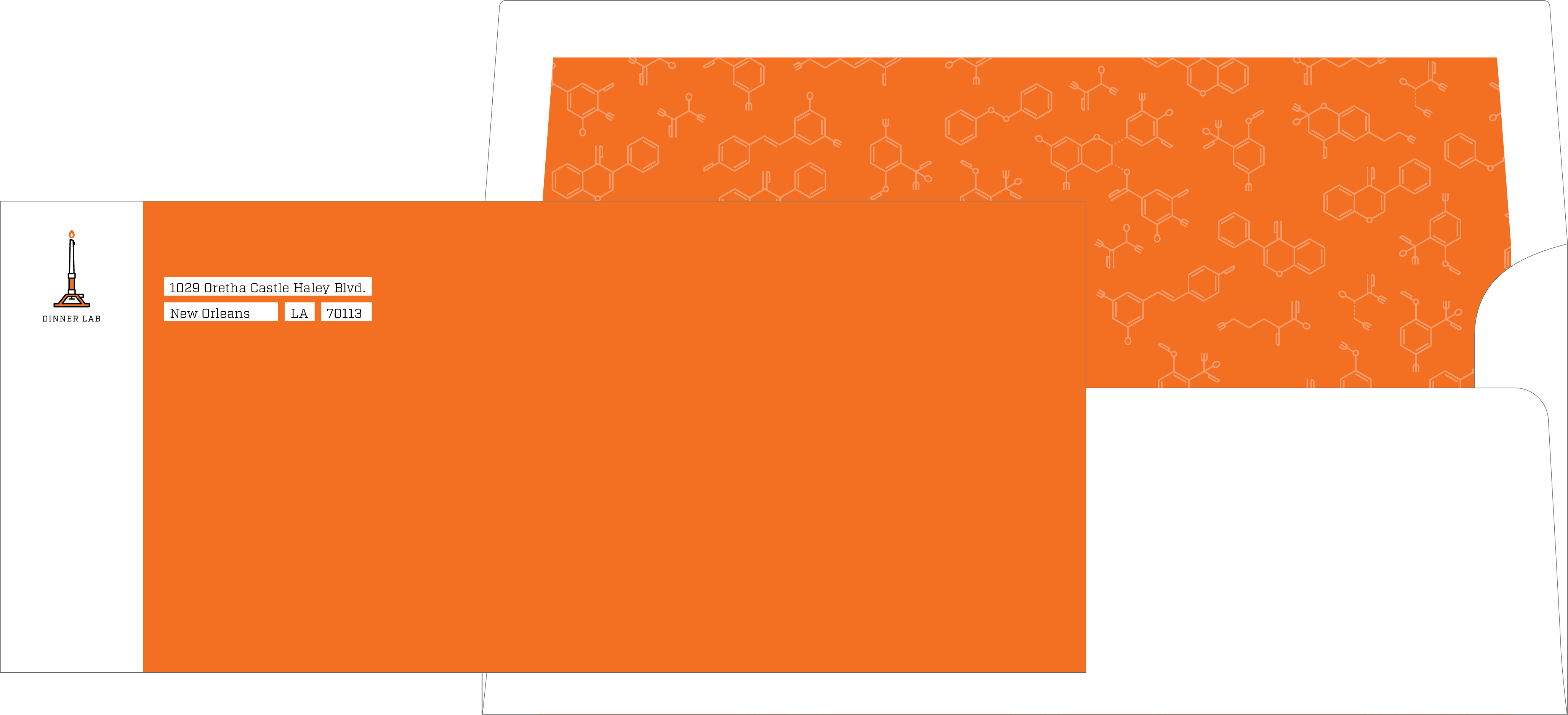
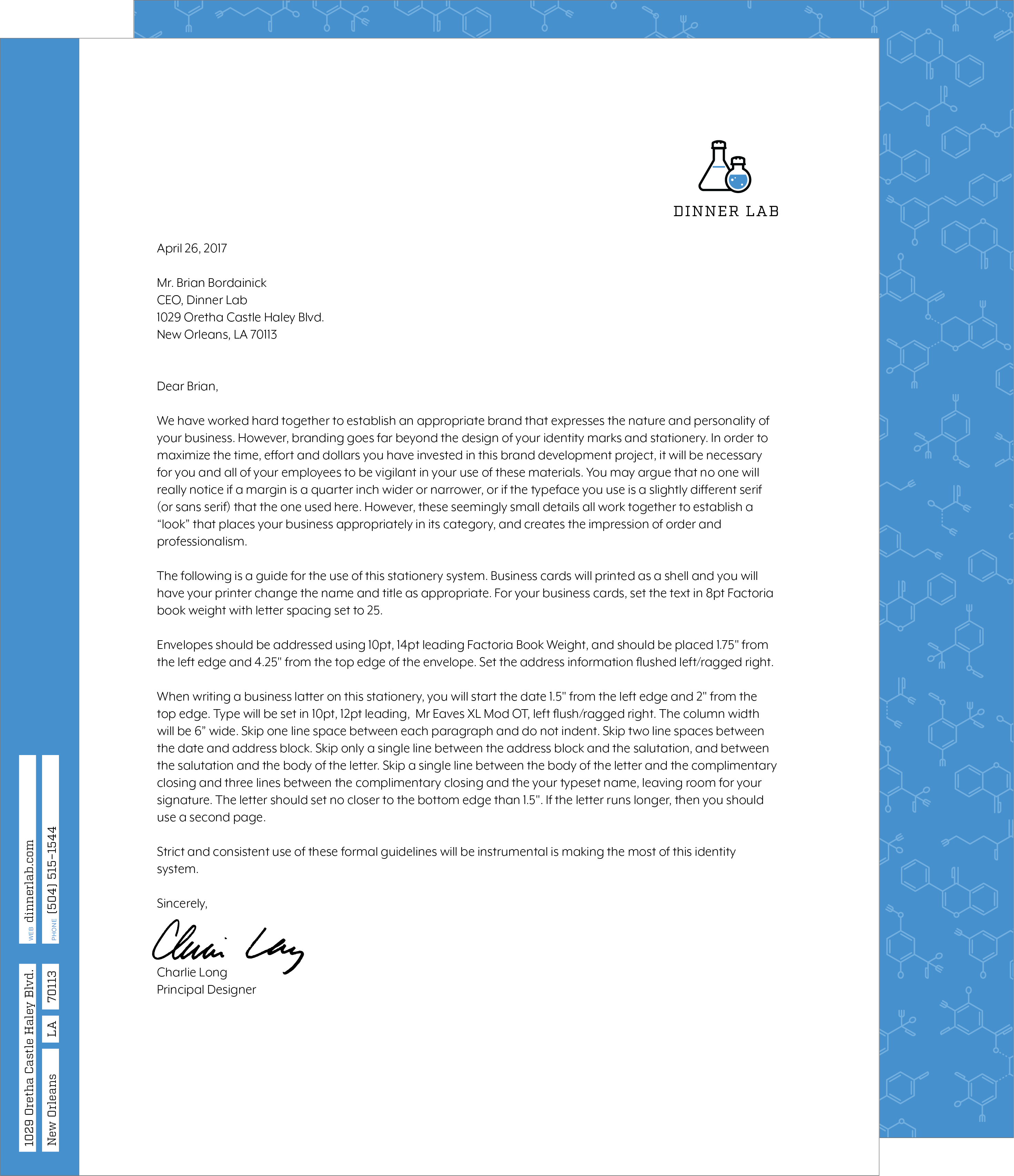
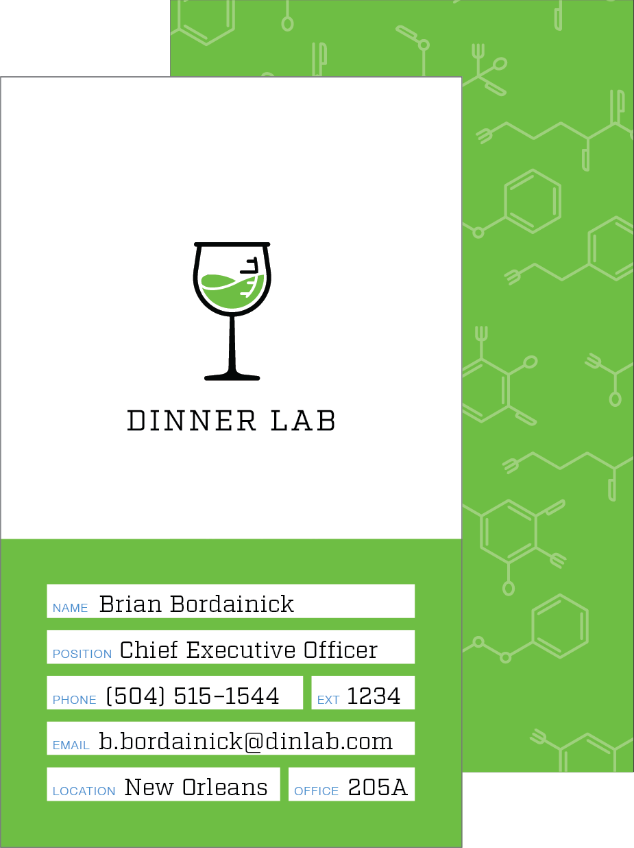
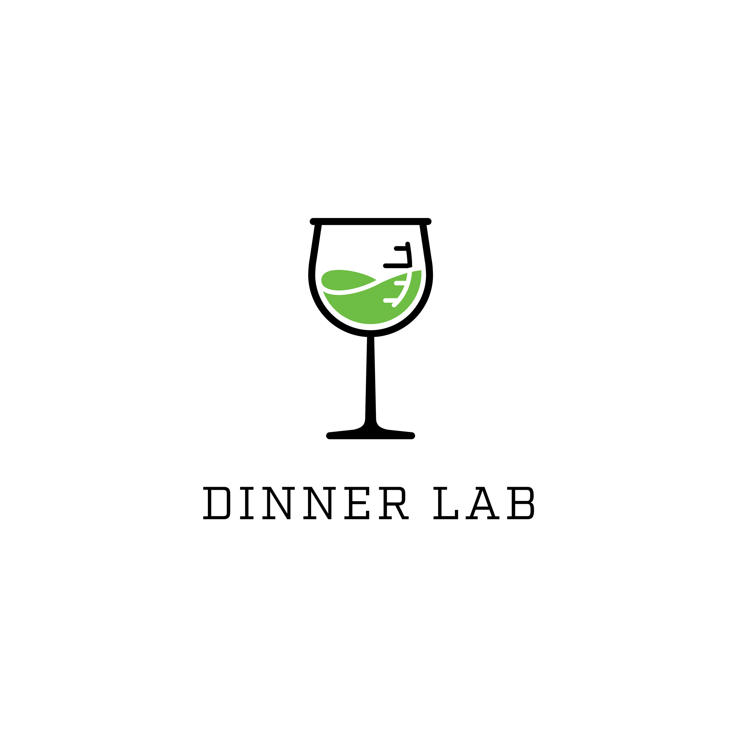
The wines glass, with measurement ticks like a beaker, and the candle stick Bunsen burner were both logomarks that fit this concept well. So in the end, we opted to use both, bringing in the salt and pepper flasks to create a satisfying trio of logomarks to use in a kinetic system.