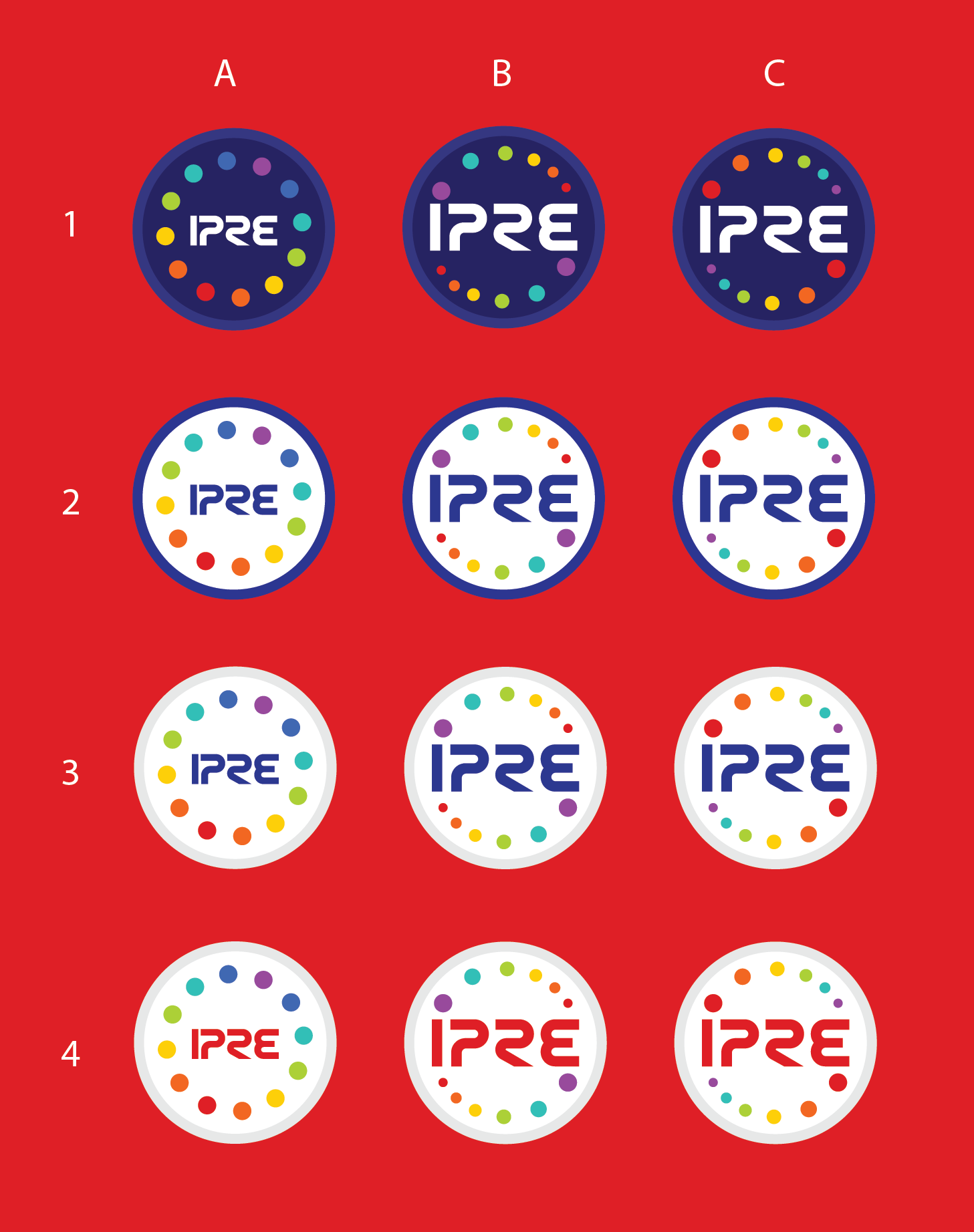
IPRE Patch

2017 | Logo | Fan Art

For a personal project, I wanted to recreate a patch loosely described in a podcast called the Adventure Zone. The nature of the organization it represents is kind of a fantasy space exploration group so I took a lot of inspiration for the type from the old NASA logo.

Oh, also IPRE stands for “Institute of Planar Research and Exploration” AKA some Dungeons&Dragons mumbo jumbo with a sci-fi twist.

The Adventure Zone © The McElroy Family
The McElroys are now selling pins of this design which you can buy here. Sales do support me directly through royalties.

(process below)

Process Work

Type

So starting out, I knew I wanted to use the NASA worm logo as inspiration for the type so I referenced it heavily during this stage, trying out variations on each letter. E was the tricky one.

Once I had these 5 worked out, I went to the Facebook fan page for the Adventure Zone to get some opinions. #2 was overwhelmingly the most popular choice, with a few people also mentioning #5.

Layout and Color

After settling on the type, I moved on to the design of the patch. The description given in the podcast described a circular navy blue patch with the letters IPRE surrounded by 12 circles of different colors. The 12 circles were to indicate the planes they were exploring.

I knew I wanted to limited the colors to be more iconic. Really the standard rainbow colors are all you need since beyond that you’re really just using different shades and tints and the colors lose their distinctness. So I played around with a 6-color rainbow scheme, opting for shades that are reminiscent of the old Apple colors. It makes it feel dated in an intentional way.

Beyond that I tried variations of background colors, type colors, and the outer “thread” color. In the end the group liked the navy as described, but I have a particular fondness for rows 2 and 4. I tried laying out the circles around the type uniformly, but it felt static and I’d seen just about every fan design do that. So I tried the crescendo of sizes looping on each side and loved it. It makes it feel so much more dynamic and intentional.

Ultimately I chose to go with 1C, making some adjustments to sizing and spacing.